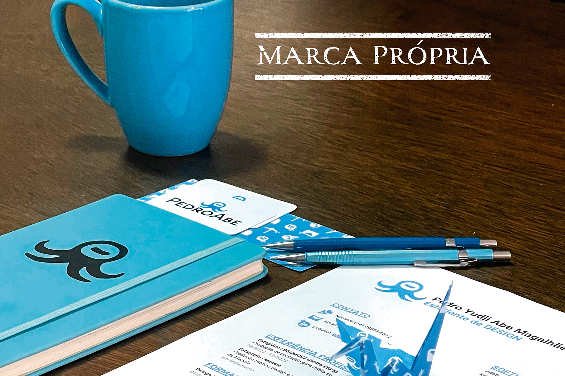
One of the projects I worked on in college was creating my own personal brand. For this project, I had guidance from Professor Marcelo Pliger. The goal was to build a visual identity that represents us, to be applied across communication materials such as resumes, business cards, and more.
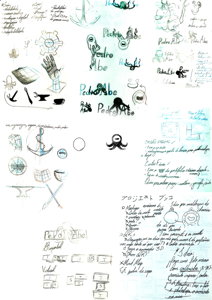
I started by analyzing the problem and defining the characteristics I wanted to represent. In this case, my own traits and values.
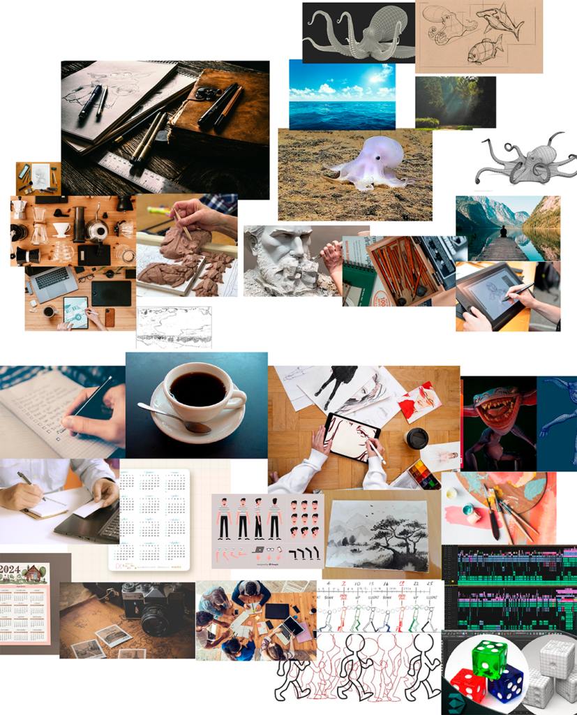
For my personal brand, I wanted something that offered a wide range of applications. It had to be versatile, engaging both in physical formats but especially in digital and motion contexts.
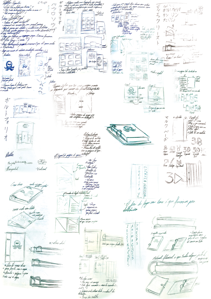
I explored several symbol ideas that could represent me and my creative process.
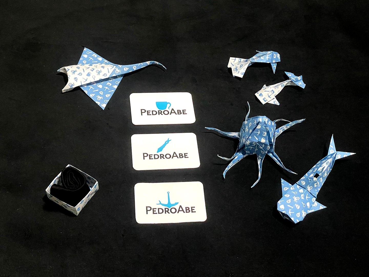
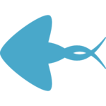
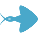
Among them was the octopus, my favorite animal, which I feel reflects many aspects of who I am and how I work. The octopus is playful, highly adaptable, curious, and its ability to camouflage by changing shape and color opened up many creative possibilities. It also matched the other qualities I wanted for my brand.
I sketched different possible forms it could take and then refined the mascot design, simplifying it to better fit my needs. I reduced the number of tentacles for clarity and personal preference. I added the horizontally slit eye, a distinctive feature of octopuses, and gave it a slight curve so it avoided negative associations and instead suggested a smile.
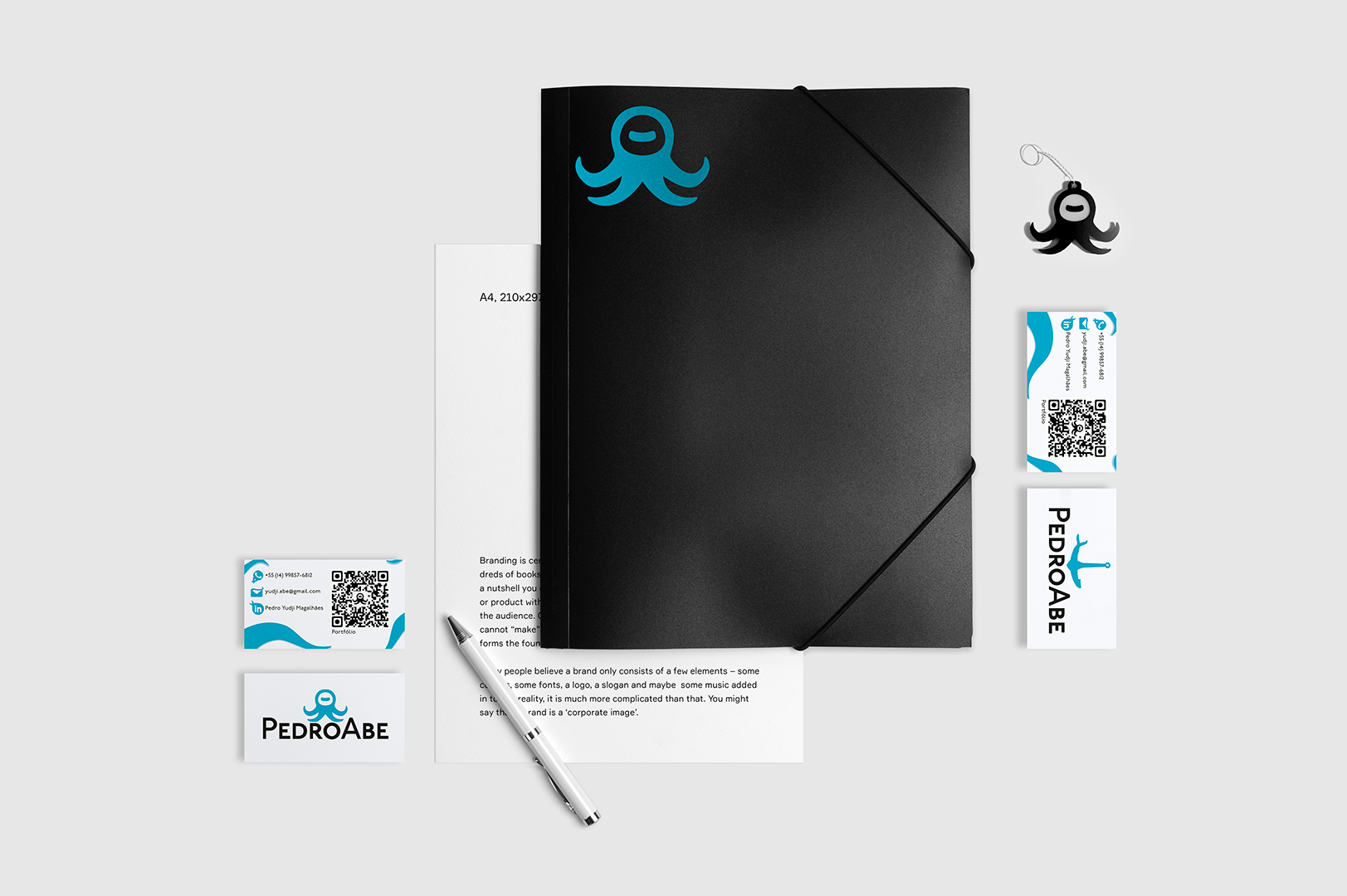
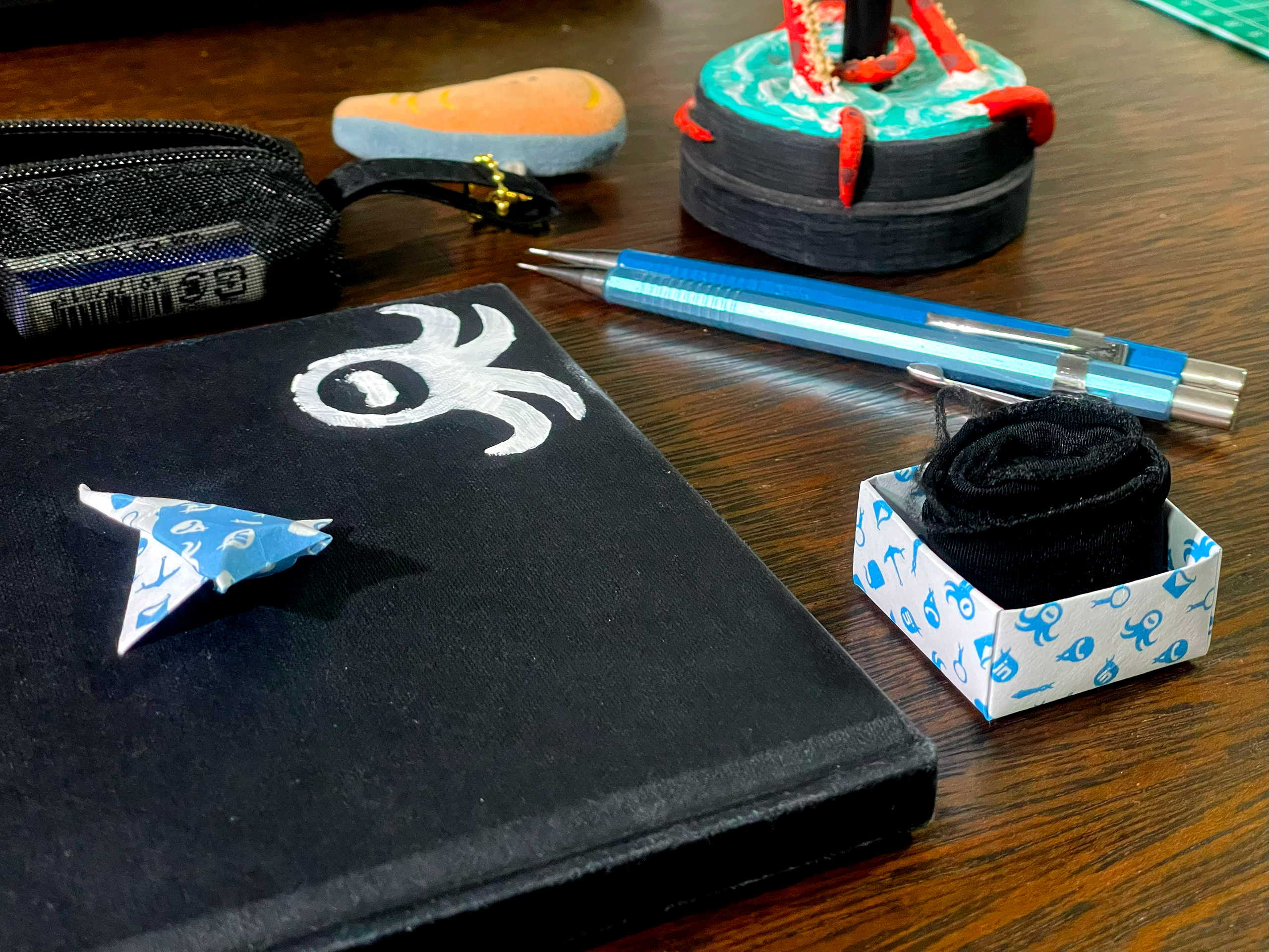
I created a pattern with the different forms of the octopus and used its association with ink to design the QR codes.
When applying the identity to different pieces, the overall system became clearer to me, how to use colors, how to keep the layouts cleaner by leaving space for the elements.
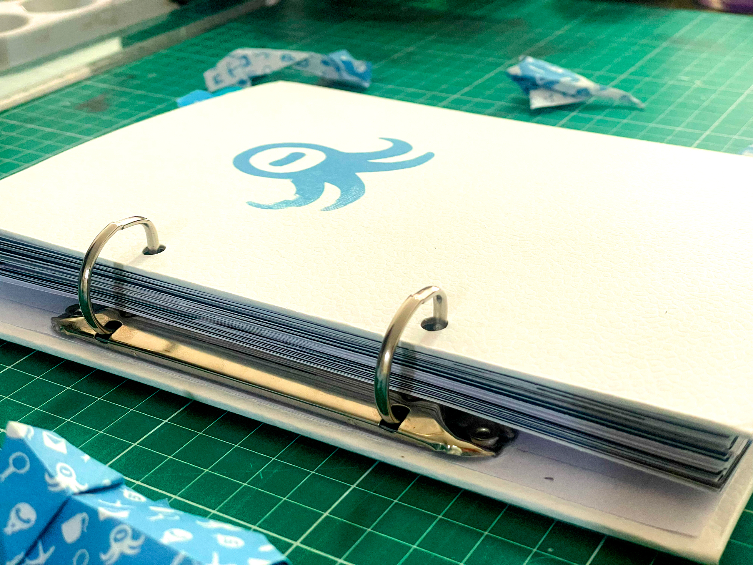
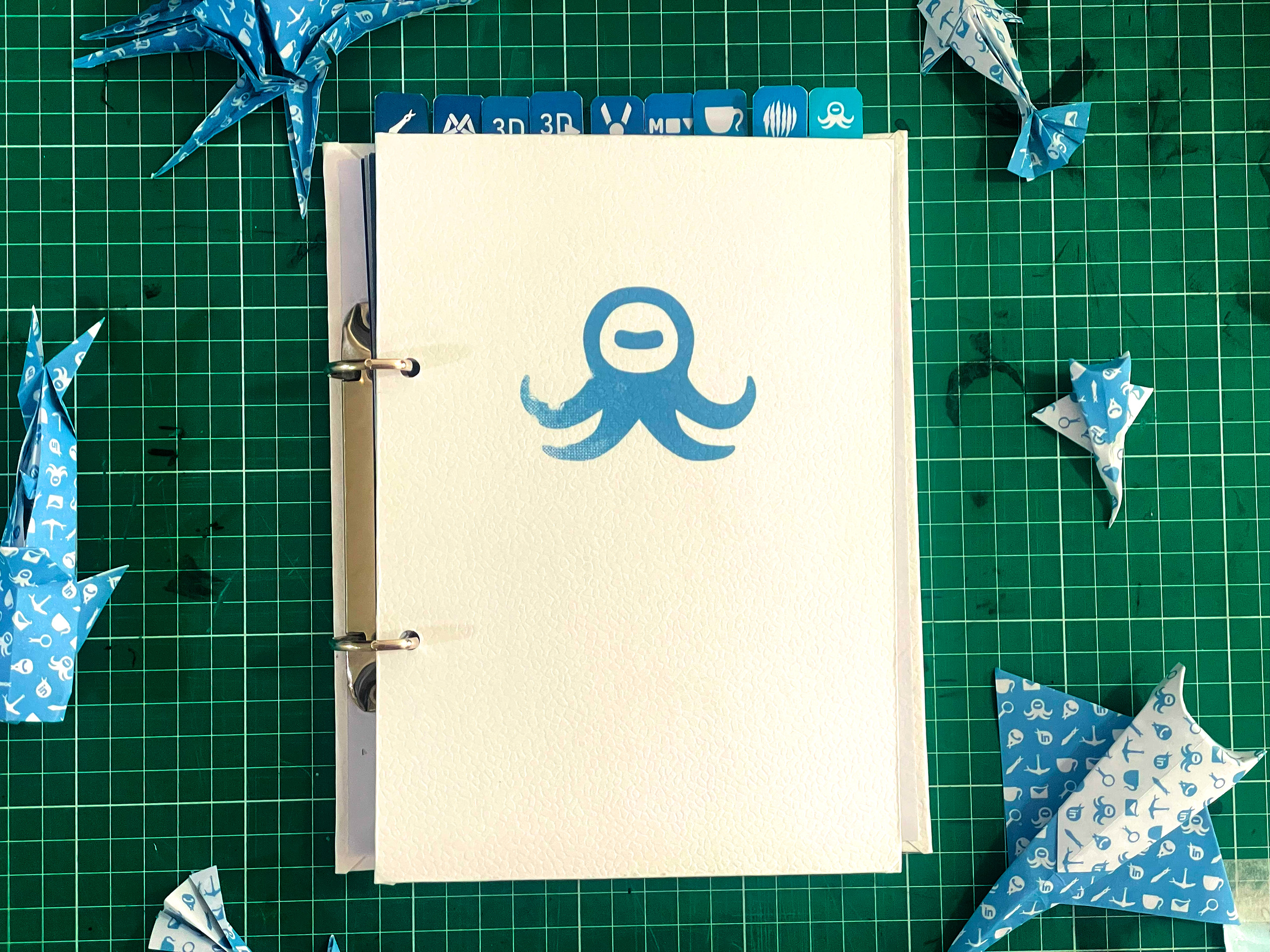
In my sixth semester, we developed both digital and printed versions of our portfolios.
Since I enjoy the more hands-on side of design, I created a binder for the printed version and assembled the cover myself. I thought it would be interesting to film the process and turn it into a video.